Case study - Brand Identity · 2025

he came to buy a logo. he left with a brand.

Liam Green moves high-value goods the length of the country. He’d tried Fiverr logos and van-wrap templates - but nothing felt like him. So we stopped selling a logo and built Liam Green Logistics: a premium delivery brand with a personality people remember.

Brand Strategy Logo & Identity Van Livery Website Social & Content

The website

Premium, right down to the pixel.

Scroll to bring the site into view - the same GTA-grade identity, carried into a fast, premium website built to turn visitors into booked deliveries.

The brief

A logo is a full stop. A brand is the whole sentence. Liam had been buying full stops - what he needed was a story worth telling.

Client

Liam Green

Sector

High-value logistics

Base

United Kingdom

Year

2025

Naming & positioning Logo evolution Van livery Business cards Website Workwear Social & video

How we built it

We didn’t start with a pen.
We started with Liam.

Before a single shape was drawn, we sat Liam down and dug into his psyche - his interests, his hobbies, the way he wanted the world to see his work. Ideas bounced fast, and one stuck: Liam wasn’t a man with a van. He was a high-ticket courier - a persona built to move valuable goods over long distances, and to look the part doing it.

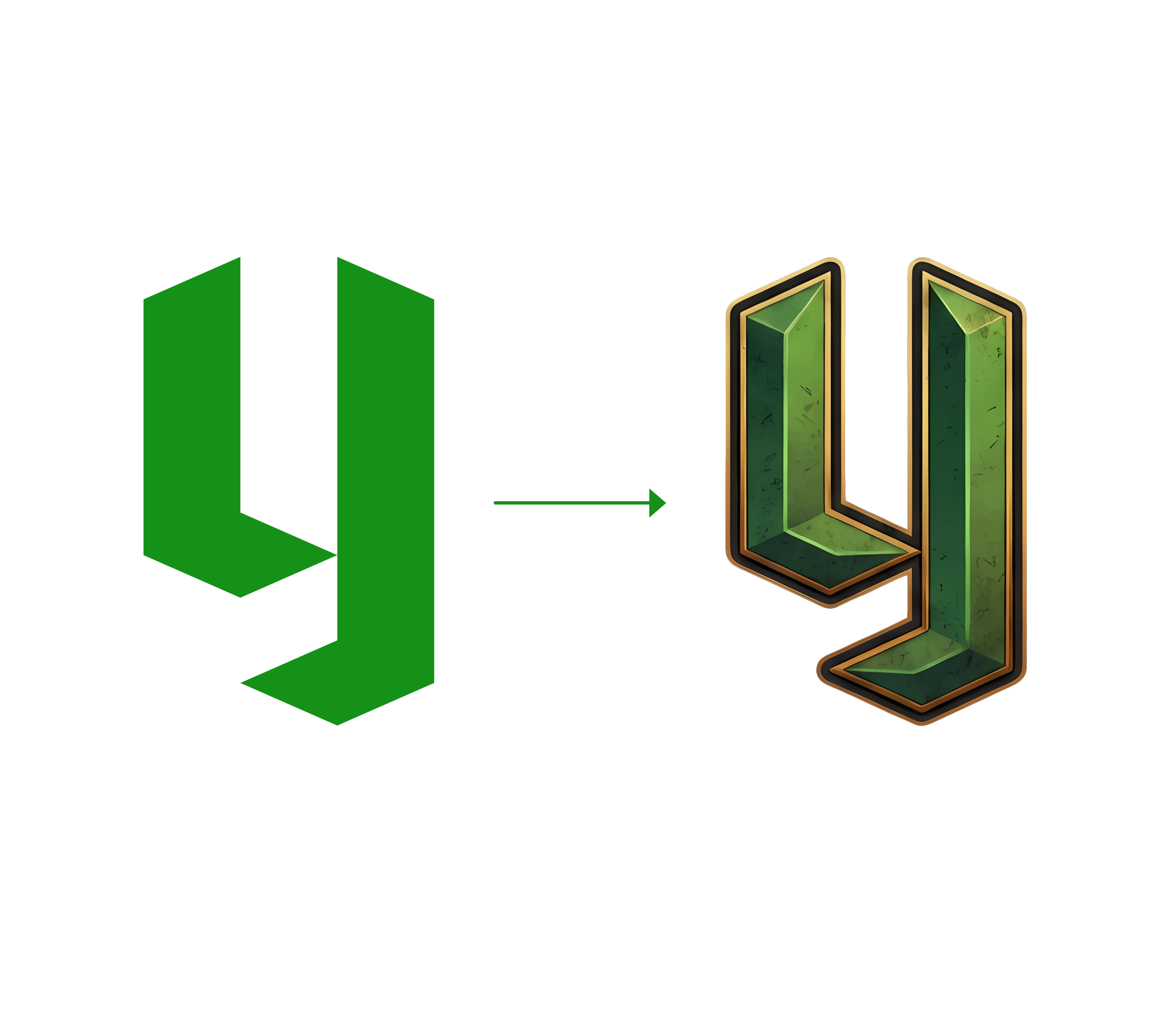
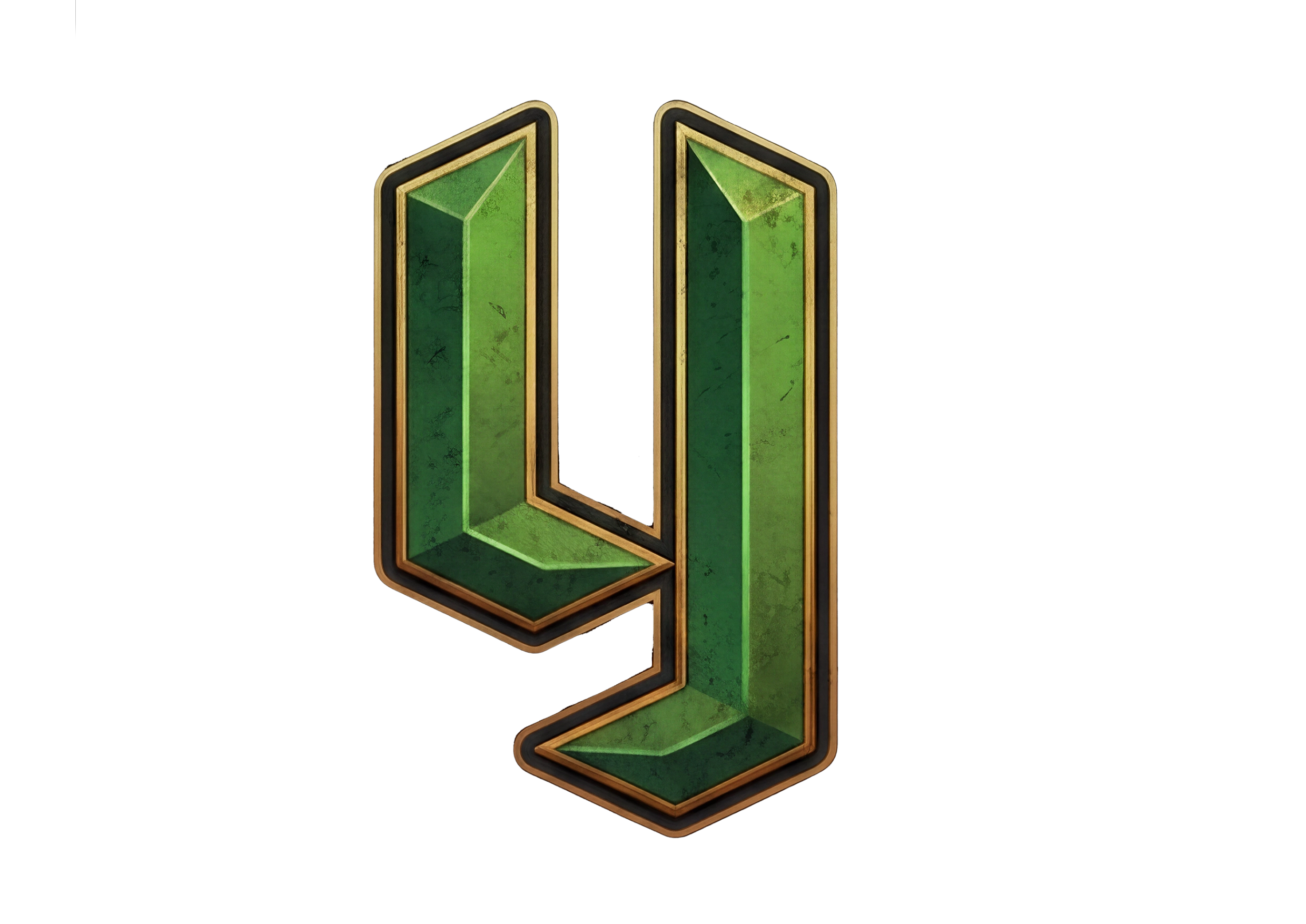
He loved the niche instantly. And as we talked about how his content should feel, one thing came up again and again: Liam is a huge GTA fan. So we ran with it. We drew him a clean, flat monogram first - then reforged it in that unmistakable GTA style: carved emerald, gold trim, a little grit. Classy, but familiar.

That logo became his anchor point - the fixed thing every other decision could hang from. From there we built outward with one rule: premium, the whole way through. Content, website, services, the van banner, the workwear - all of it engineered to make a logistics company impossible to overlook, with Liam’s personality wired into every layer.
The anchor point

Flat idea, forged into gold.

The same monogram, twice. On the left, the clean foundation - the shape that would scale anywhere. On the right, the hero treatment: beveled emerald, gold edging, and just enough grit to feel like it belongs on a collector’s garage wall.

LG Logistics logo evolution - flat green monogram transformed into a GTA-style emerald and gold 3D mark
01 - Flat monogram · the foundation 02 - GTA hero mark · the personality

The concept

The logo was designed with subtle character, integrating the L and G into one singular mark. The use of green reinforces trust, motivation, and the brand’s identity, while also creating a subtle play on the client’s name.

By placing a smaller L against a larger parallel shape, the design creates a broken G, hiding the initials in plain sight. This gives the logo a unique visual payoff, creating that “ohhh” moment when the concept clicks, while staying true to the client’s original vision of incorporating textures inspired by video games. The overall direction was created to align with the brand’s content and the idea of “Mission Complete.”

The positioning

Luxury logistics,
handled with precision.

Every courier promises to be reliable. We gave Liam a promise nobody else in his lane was making - and a look premium enough to back it up. Elite delivery, treated like a service, not a lift.

ELITE

Delivery &
Collections

HANDLED WITH PRECISION

In motion

We didn’t just design it.
We filmed it.

A premium brand needs premium content. We shot and cut a services film and van reveal to give Liam a social presence that matches the livery.

Services film - the offer, in Liam’s own voice.

Van reveal - the brand, on the road.

0

Flat logo, reforged into a hero mark

0

Branded touchpoints, one system

0

Service positioning, UK to Europe

0

Bespoke - no template in sight

Your brand, next

Selling a service?
Make it feel premium.

From a one-van courier to a brand people remember - if you’ve got something worth delivering, we’ll make it impossible to overlook.